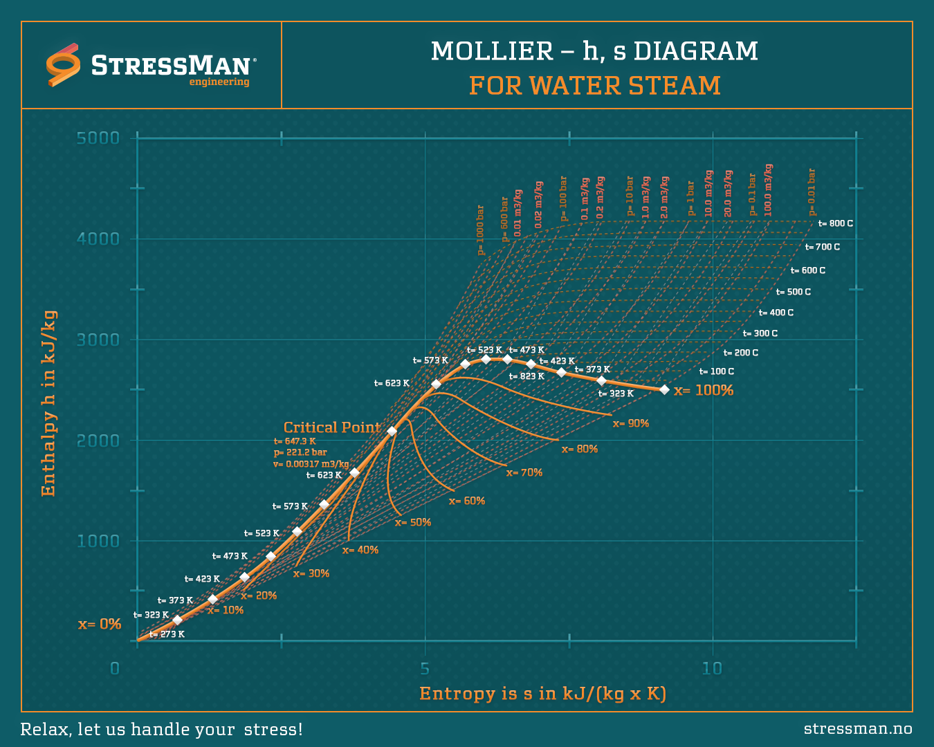
Harnessing Thermodynamics: The Power of the Mollier Diagram
Every decision in energy systems holds the key to efficiency and sustainability. One powerful tool engineers rely on is the Mollier Diagram—a visual roadmap of enthalpy (h) versus entropy (s).
Why it matters:
The Mollier diagram isn’t just a chart; it’s a guide to designing efficient systems in power generation, refrigeration, and air conditioning. By showing how water and steam behave under different pressures and temperatures, it helps us unlock peak performance.
Key Features:
Isobars and isotherms reveal pressure-temperature relationships.
Saturation lines and steam quality percentages guide turbine and boiler optimization. Critical points highlight the boundaries between liquid, vapor, and supercritical states.
Real-world example:
Imagine optimizing a steam turbine. By visualizing the process on the Mollier diagram, you can calculate the enthalpy difference between inlet and outlet—turning complex data into actionable insights.
Whether you’re designing for sustainability or improving efficiency, the Mollier diagram remains an indispensable tool in our thermodynamic journey. Let’s decode its complexities and drive greener, smarter engineering solutions!

